Other Pages

Griding With Bootstrap

Goals

    As users view sites on laptops, tablets, and phones, web developers have invented a way to accomodate different screen sizes without making seperate sites. This design paradigm uses something called a 'grid' that dynamically updates depending on the screen. This challenge will help you learn to understand the grid and make responsive websites with Bootstrap's own system.

  • Learn about formatting a webpage with Bootstrap's grid system

  • Make a website that looks good on a full sized laptop as well as on a phone.

Steps

Step 1

Add the Bootstrap CDN link in the head of your page with the following url:

<link rel="stylesheet" href="http://maxcdn.bootstrapcdn.com/bootstrap/3.3.5/css/bootstrap.min.css">

Step 2

For horizontal slicing, Bootstrap uses 'rows', which look like this:

<div class="row">
  <p>This will take up a whole row</p>
</div>

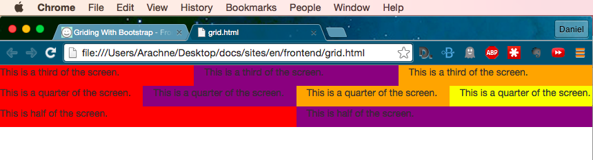
For vertical slicing, Bootstrap uses a 12-column layout for a webpage, which means that each 'column' represents one twelfth of the screen. 12 columns was selected because a screen can easily be divided up into logical segments: three 4-column elements, four 3-column elements, two 6-column elements, six 2-column elements, and any combination thereof (one 6-column element and three 2-column elements, for example).

Notice the 'col-sm-6'? That's a class that tells Bootstrap that on a small screen, the element should take up six columns. There's also 'col-lg-x' and 'col-md-x' for large and medium screens respectively.

<div class="row">
  <div class="col-sm-6">
    <p>This will take up half of a row</p>
  </div>
  <div class="col-sm-6">
    <p>This will take up half of a row</p>
  </div>
</div>

Step 3

Using the above as a reference, try to make a page that looks like this:

Step 4

If you're trying to make a website that will look good on all screen sizes, you can specify different classes for each size like so:

<div class="row">
  <div class="col-sm-12 col-md-6 col-lg-4">
    <p>This will take up a third of a row on a large screen.</p>
  </div>
  <div class="col-sm-12 col-md-6 col-lg-4">
    <p>This will take up half a row on medium screens.</p>
  </div>
  <div class="col-sm-12 col-md-6 col-lg-4">
    <p>This will take up a full row on small screens.</p>
  </div>
</div>

Try making some columns and resizing the screen to see how the elements stack and unstack when the screen size changes.

Explanation

Final thoughts!

The grid is one of Bootstrap's most powerful features. In fact, many developers who generally build their own components often still use the grid from Bootstrap (or Foundation) simply because it saves time in development by making it easier to build sites that work on all screen sizes.

Grid Reference